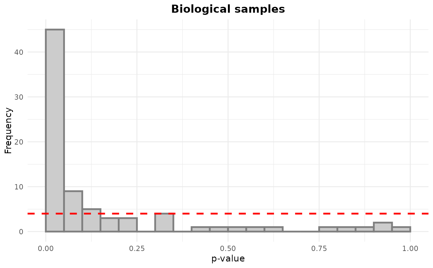
Draws histograms of p-values with expected uniform distribution represented by a dashed red line.
Arguments
- p_values
list or data frame, each element/column is a vector of p- values. The list names are used as plot titles
- hline
logical, whether a horizontal line representing uniform distribution should be plotted
- combine
logical, whether plots of individual p-value vectors should be combined into a single object. Set to FALSE if you want to add other plots to the list before plotting
- x_label
the x-axis label
Examples
data(example_set)
lm_sample <- perform_lm(drop_qcs(example_set), "Feature ~ Injection_order")
#> INFO [2025-06-23 22:37:47] Starting linear regression.
#> INFO [2025-06-23 22:37:47] Linear regression performed.
p_values <- list("Biological samples" = lm_sample$Injection_order_P)
plot_p_histogram(p_values)